-
POM
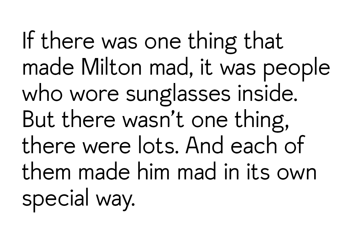
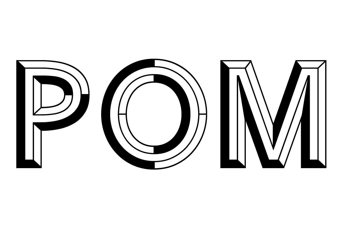
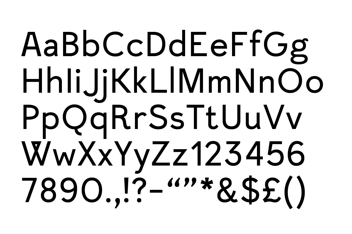
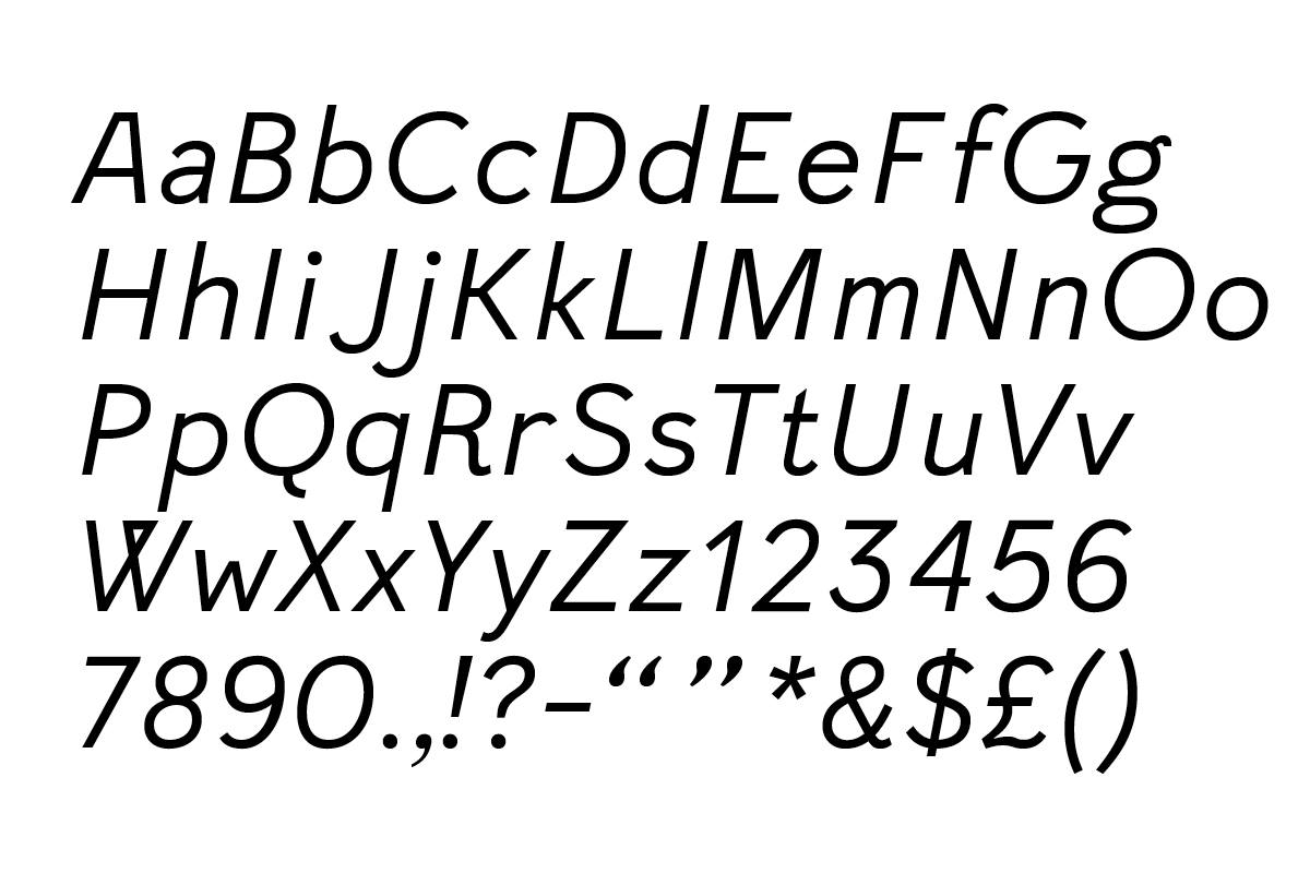
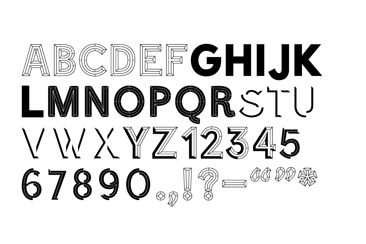
POM was produced for the Power of Making exhibition at the Victoria and Albert museum, it includes a body, italic, semi-bold and a headline weight with five variations. The design touched upon the spectrum of making in the show; the headline referenced the bold and expressive, while the body looked to the refined and meticulous. We are currently looking to develop the typeface for commercial release. See also the Power of Making exhibition, and the Power of Making publication.
Text source - Irritable by Will Ashon
Typeface
2011 -
-

-
-
-
-
